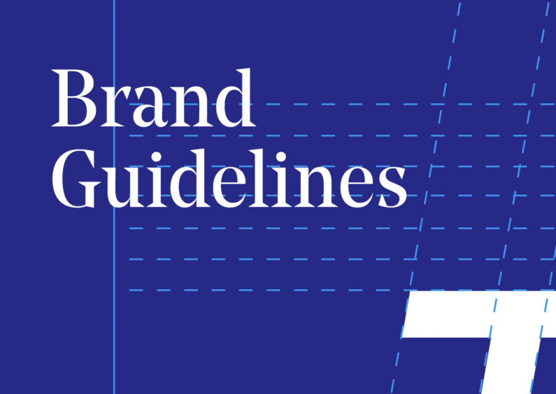
Brand Guidelines FTW
One of the most vital items when rolling out brand development phase of work Brand Guidelines, whatever the scale or scope of work required.
From consistent logo use, tone of voice, typographic styles, colour palettes and application standards, each provide the vital specifications and direction needed for a coherent brand identity system to be effective and to thrive.
Below are a few specific examples of how we approached the provision of such vital communication tools.
The Lonach Hotel
Set within the incredible landscape of Strathdon, The Lonach Hotel is being developed on the site of the old Colquhonnie Hotel. When built it will provide the area and those visiting with a modern take on traditional Scottish hospitality.
Come away in. The first stage of the project was the launch of The Steading Bar in June 2019, which not only provides a glimpse of what's to come with the fuller development but also provides the locals with an authentic, family pub that can become a crucial hub for this rural community.
Working with the architects and interior designers has ensured that the brand guidelines not only cover logo use parameters but take into account the collective aesthetic across the interior and exterior, providing a clear approach for all materials and touch-points as the development approaches completion.


Drouthy Cobbler
A fantastic independent café, restaurant and venue, The Drouthy Cobbler in Elgin commissioned us to evolve the brand identity to both simplify it's use whilst provide an extension to the secondary graphic language.
Over the months and years to follow, this would allow them to create a myriad of different marketing materials - all part of a cohesive visual system whilst having the flexibility to be fresh and stand-out.


Verus Petroleum
Verus Petroleum is an independent oil and gas company who tasked us to design and build a new website whilst expanding the graphic language of their existing brand identity that had been produced by another agency in the past.
Without relying on tired icons or overt ‘energy’ imagery, we developed a detailed hierarchy of typography that would allow clear communication of narrative, statistics and pull-out information.


Duncan and Todd Opticians
In 2017 the Duncan and Todd Group began offering Hearing Care as part of their drive towards continued clinical excellence for their patients. This meant an evolution of this well established and recognisable high street brand.
The guidelines had a real practical application to demonstrate how signage should be designed and applied for the various shop front styles and sizes they have across over 30 practices nationwide.


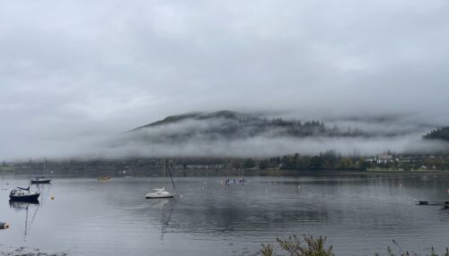
Snowroads
Along with Lateral North we were tasked by the Cairngorms Business Partnership to research and create a brand for the Snow Roads project. Through community engagement, on the ground research and full brand development, together we created an identity and framework with the which future work could be developed.
Of course, the brand guidelines had to be technical in nature to allow other 3rd parties ease of use, however it was also important to inspire by demonstrating how key future materials could be created.


If you would like to understand how our approach to brand and brand guidelines could help your business, let us know and we'd happily bring the coffee.
Other Articles
42 Divided by 10. Part 8 - Bauhaus and Digi-bananas. →