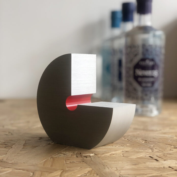
Never.25

A message on and in a bottle
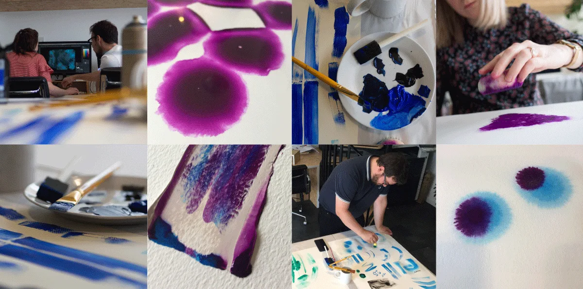
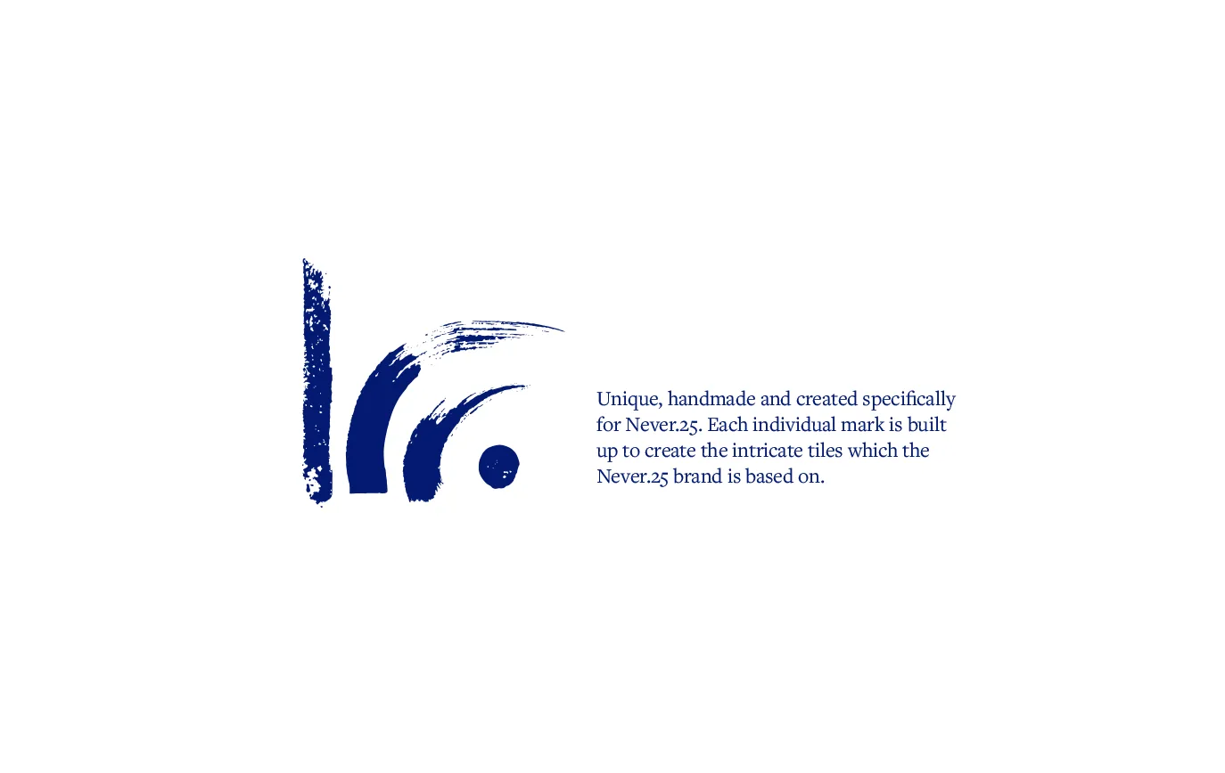
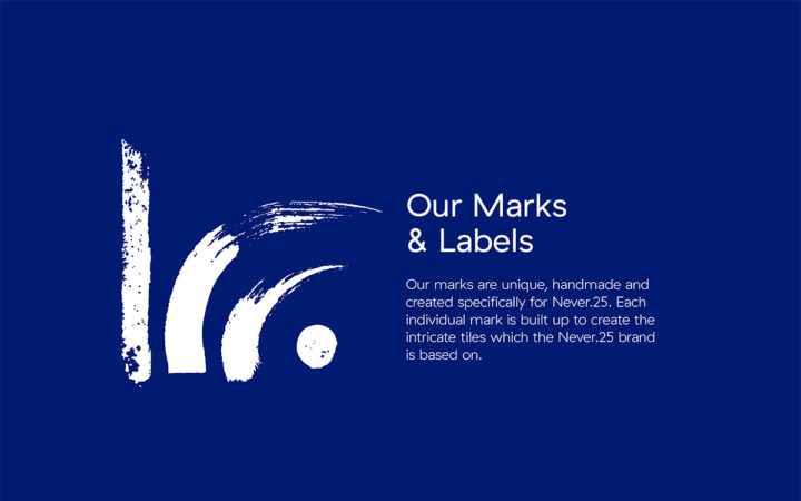
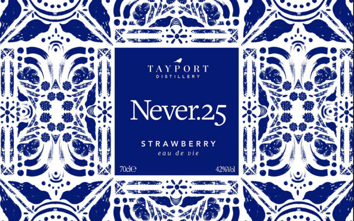
At the core of the brand identity was the creation of handmade marks from bluebirds to grain. These marks are direct reflections of the brands story, its people and its ethos.
Unique, handmade and created specifically to tell the story of Never.25, the owner Kecia McDougal and the local produce at its heart.
WINNER - Silver Award, Graphis Design Annual 2020 (Print / Food & Beverage category)
Art Direction
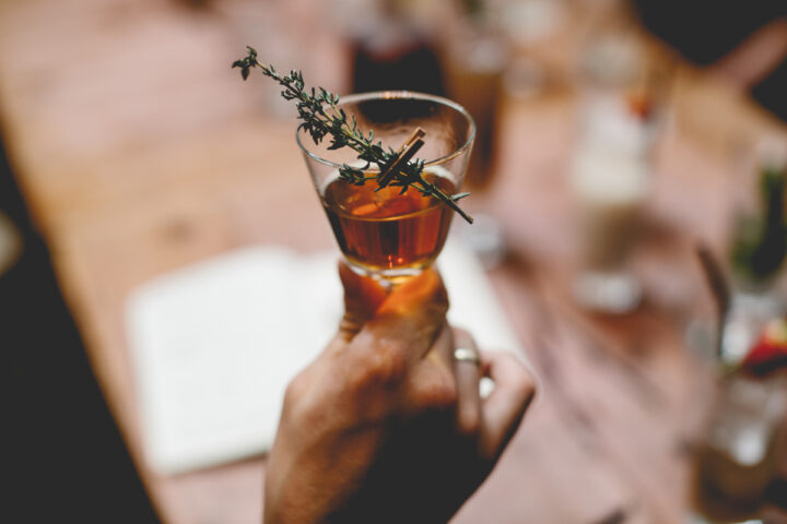
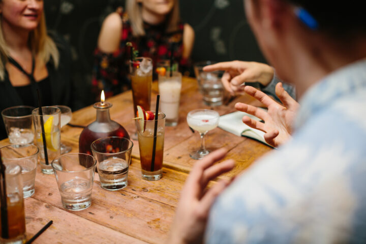
Marketing & Launch
Brand & Packaging
Brand Strategy
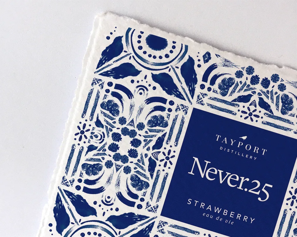
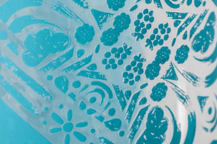
Heart felt and hand-generated
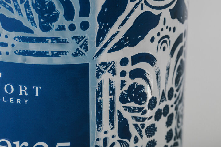
These hand-generated marks went through a labour of love to make them ready for a modern print process, whilst ensuring the authenticity and texture that the marks were originally made with was retained.
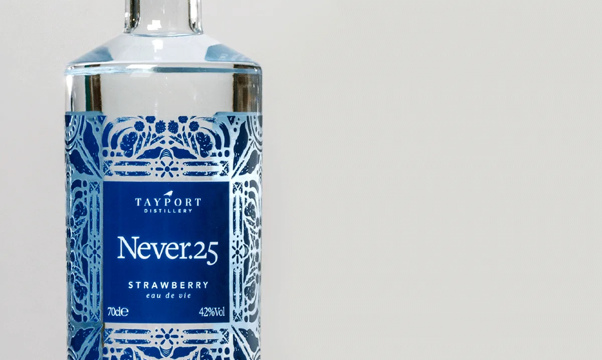
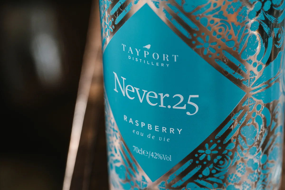
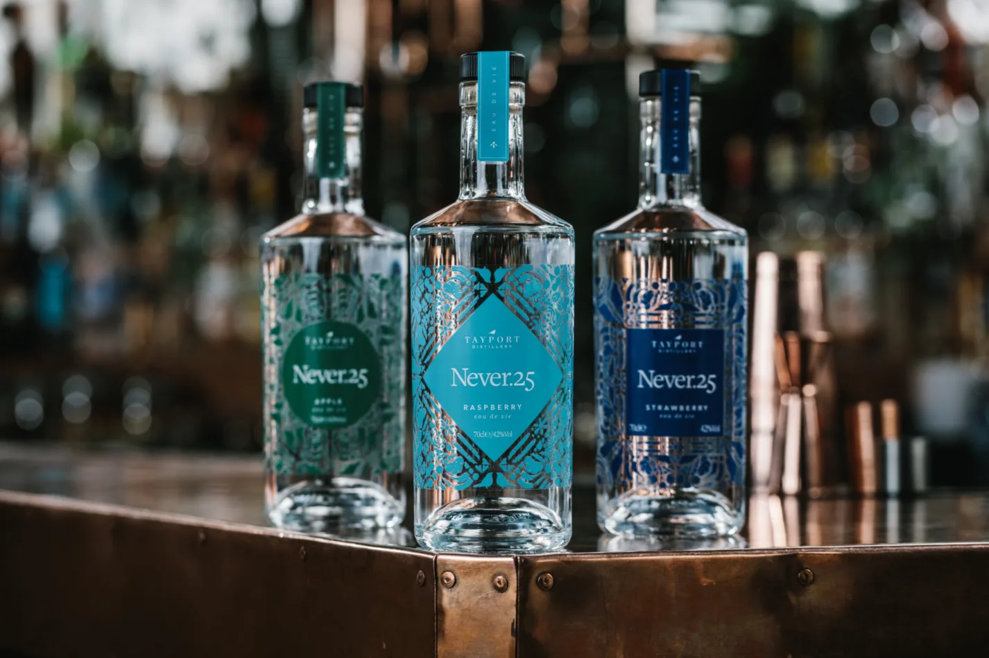
The results were incredibly detailed, tactile patterns surrounding a bold and confident centre tile. This was carried across three different product flavours to distinguish their individual characters.
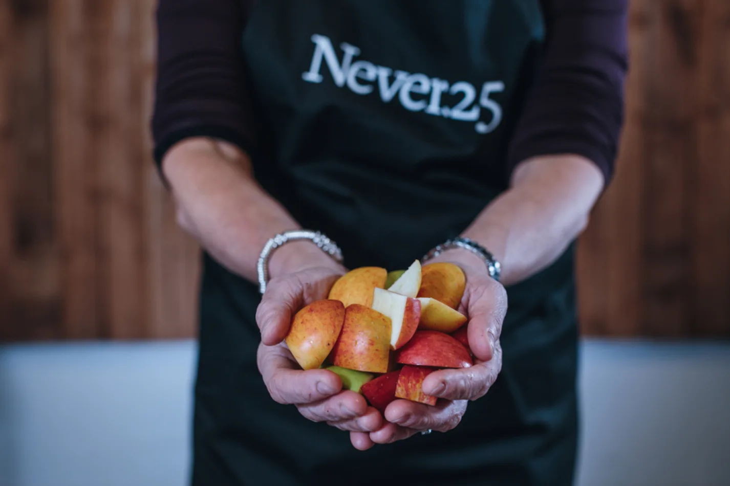
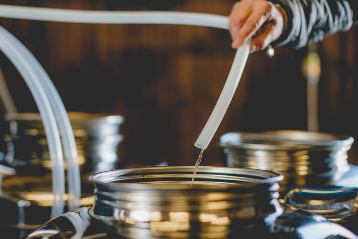
Family owned and operated, Tayport Distillery is a micro-distillery based in Tayport producing Scotland’s first range of true field-to-glass Eau de Vie.
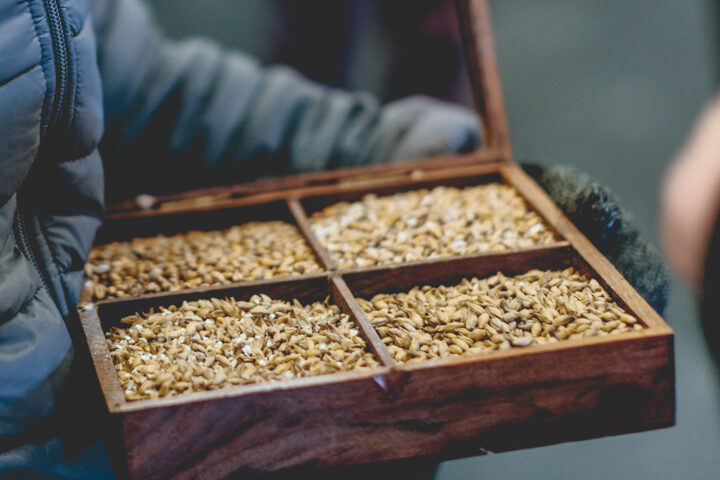
Surrounded by amazing fruits and grain of Fife and Angus, they set out to create a truly authentic spirit that broke all rules.
Unburdened by convention, they distil in an instinctive way which fuses tradition and modernity in this ground-breaking approach to making Eau de Vie.
It was our task to carry this authenticity into the brand - to develop something that conveyed the creativity, honesty and bravery of the people behind this pioneering new spirit.
We were responsible for the development of the brand through strategy, delivery of the identity, packaging, social strategy, e-commerce website and marketing.
Graphis Award
We were very pleased to pick up a Silver Award for this Never.25 project in the Graphis Design Annual 2020 – Print / Food & Beverage category.