


- Brand Creation|
- Web Design|
- Packaging|
- Brand Strategy
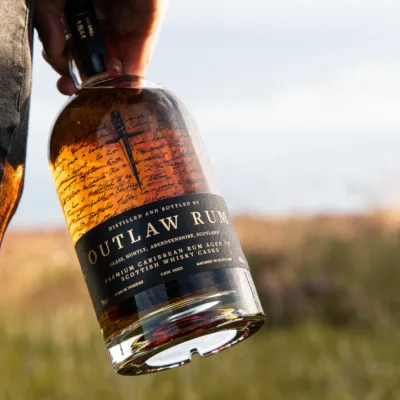
Outlaw Rum
Brand and packaging for a rebellious spirit
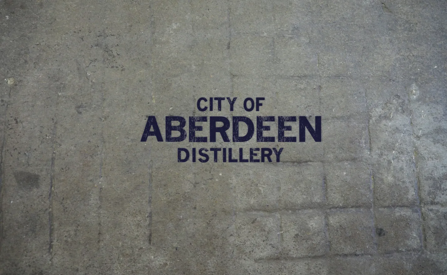
A city’s heritage on its sleeve.
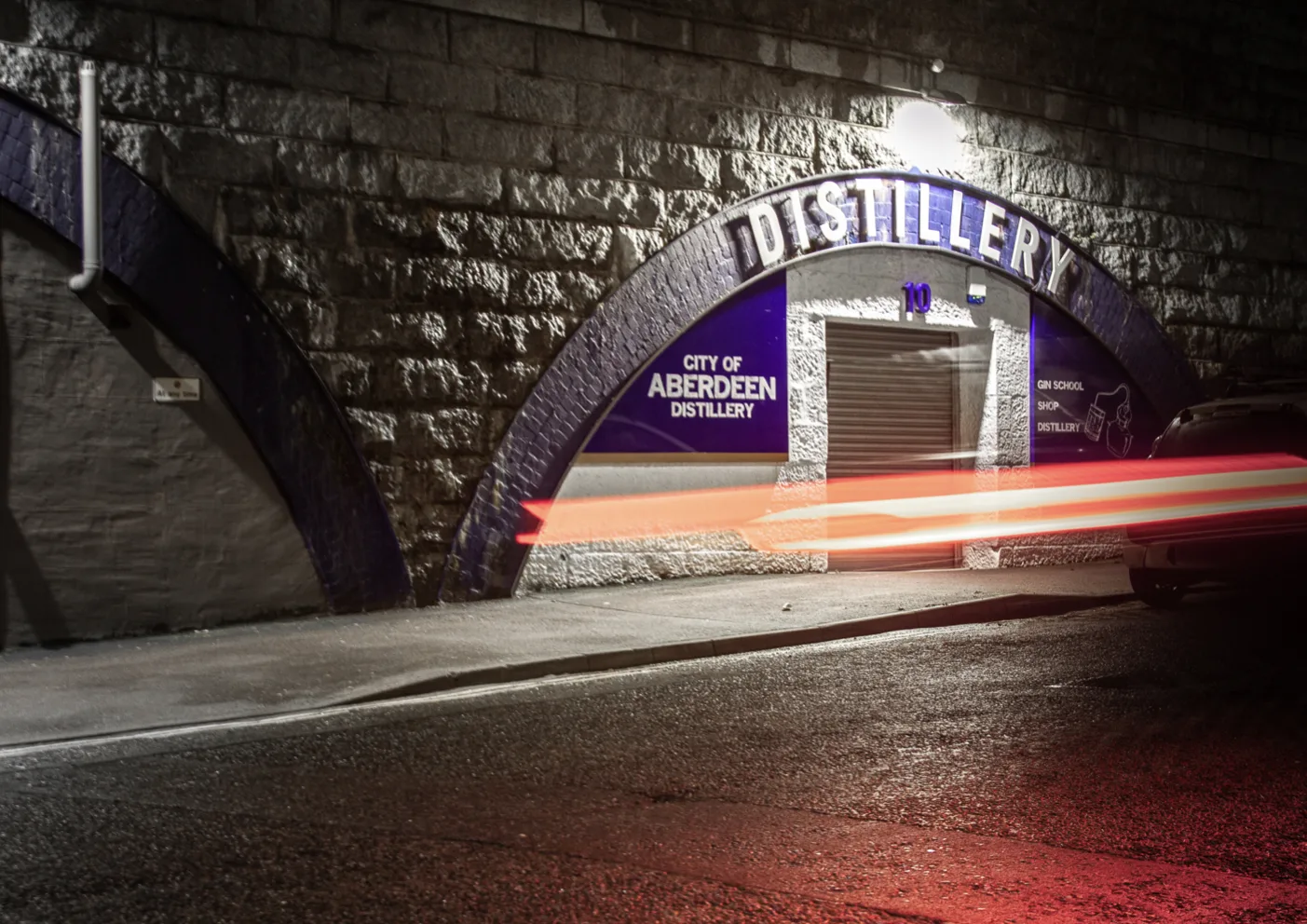
75 years after the last Aberdeen distillery closed its doors, the new City of Aberdeen Distillery aims to restore the Granite City’s distilling tradition. Located under a railway arch near the city centre, it’s home to Aberdeen Gin School – a truly authentic gin-distilling experience.
The CoAD brand needed to be steeped in civic pride – celebrating the traditions of hand-crafted produce and the stories, told and untold, of the city’s economic and industrial histories. A celebration of Aberdeen's heritage but also a chance to tell a contemporary story of a changing industrial city.
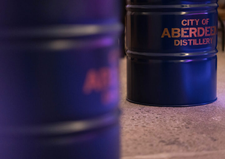
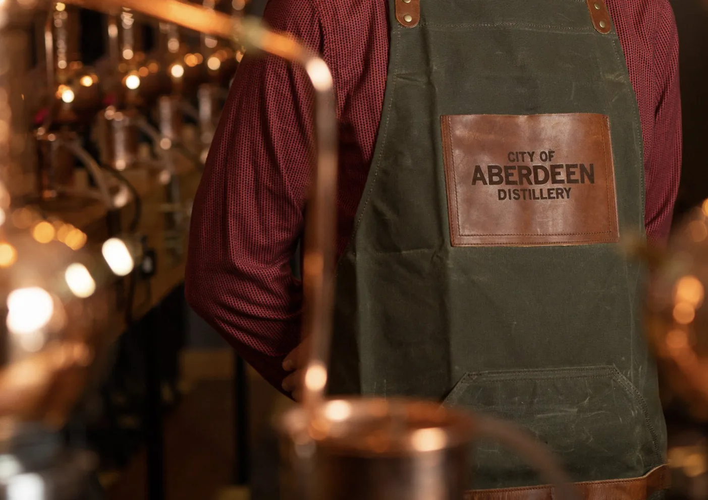
Brand Development
Bottle Decoration
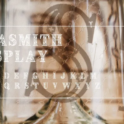
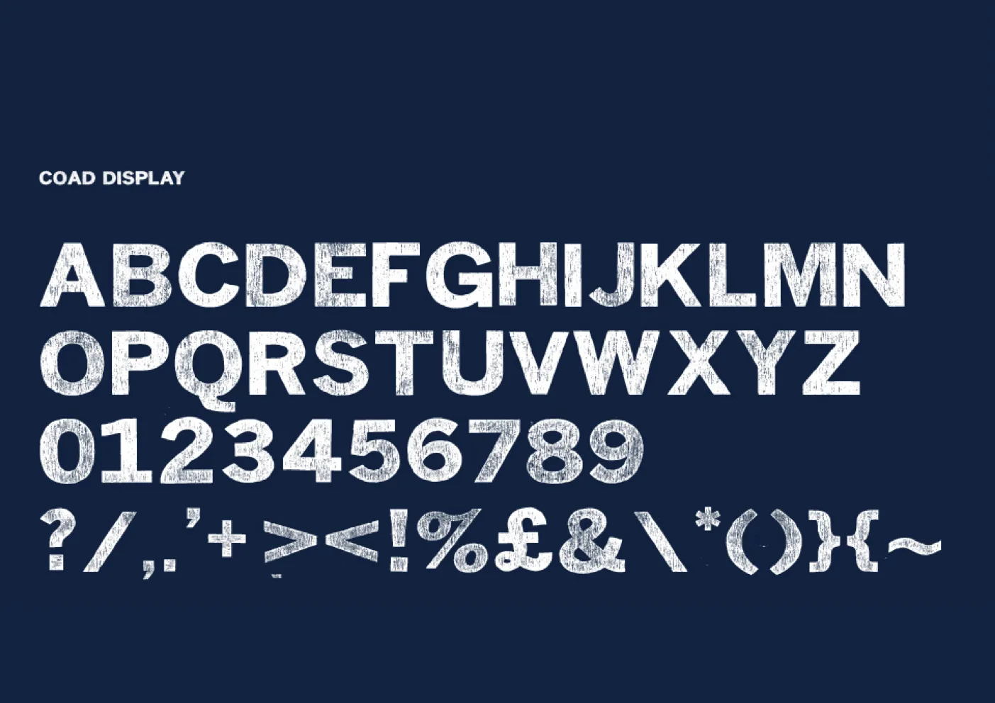
Type Design
Illustration
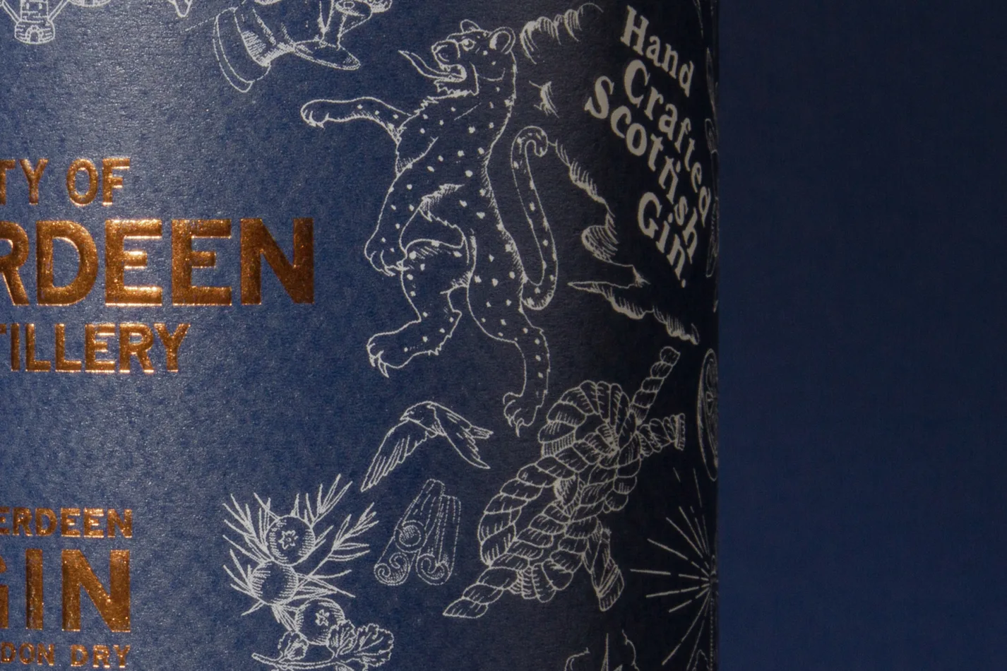
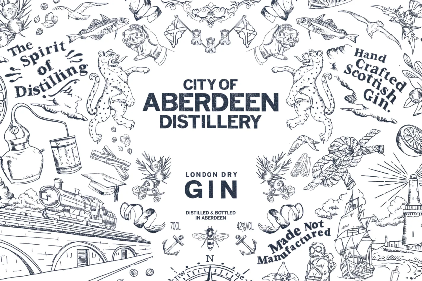
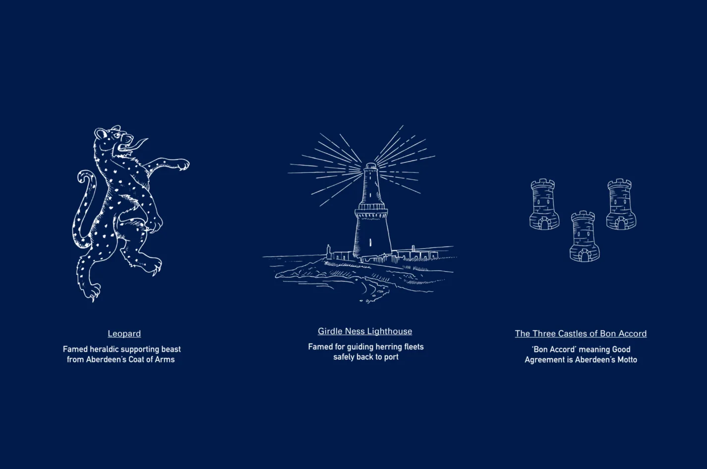
To support the bespoke typeface CoAD Display, we also worked with illustrator Lynn Crawford to create a range of over 30 pen and ink illustrations, each one helping to tell the story of Aberdeen’s maritime and industrial heritage.
These include a ship bearing the name ‘Anna’ – a vessel wrecked off the coast in 1959 – as well as references to historic trades and traditions, including the founding of the first limited company in Britain and the building of famous clipper vessels that helped establish global tea trade.
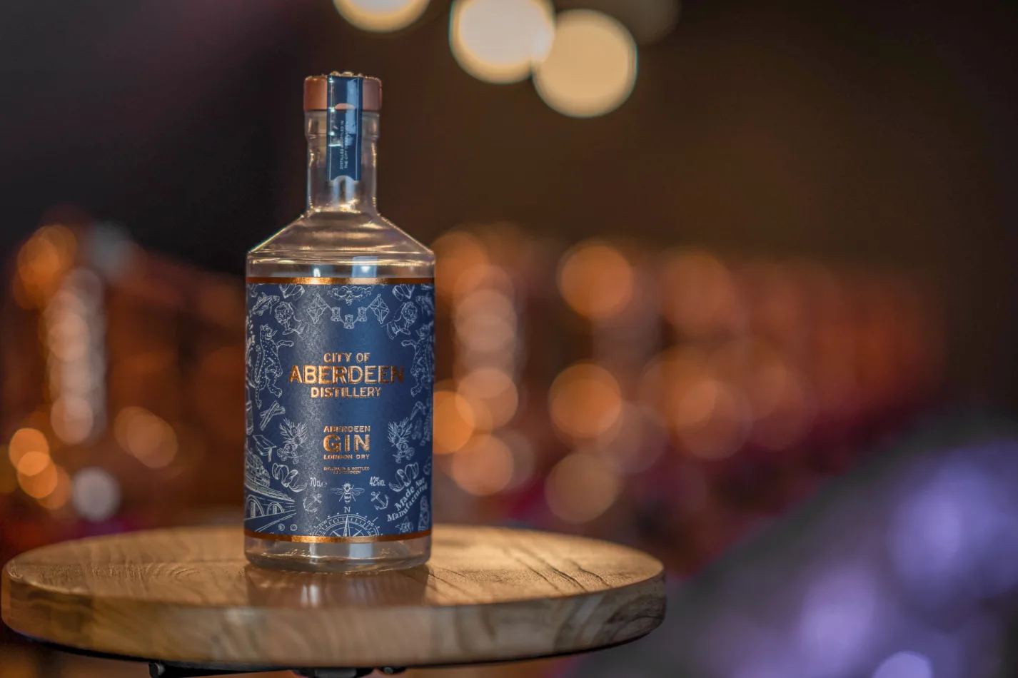
The bottle label also features two leopards – ‘supporting beasts’ which feature on the City of Aberdeen’s coat of arms – for which we sought and were granted approval of usage by the Scottish Court of Heraldry, adding a very real civic pride to the brand.
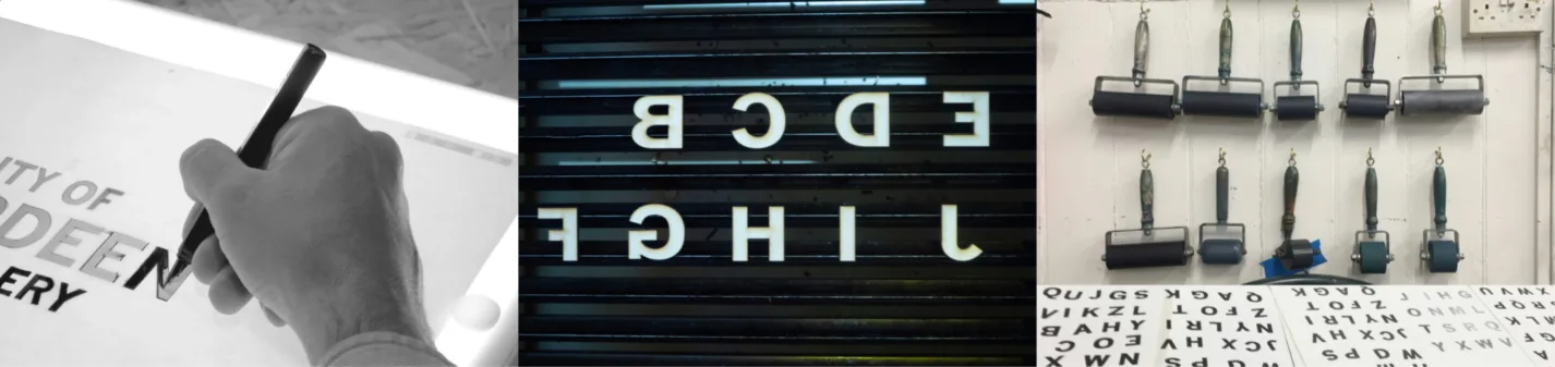
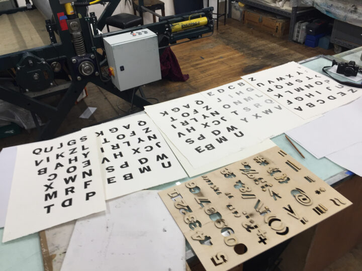
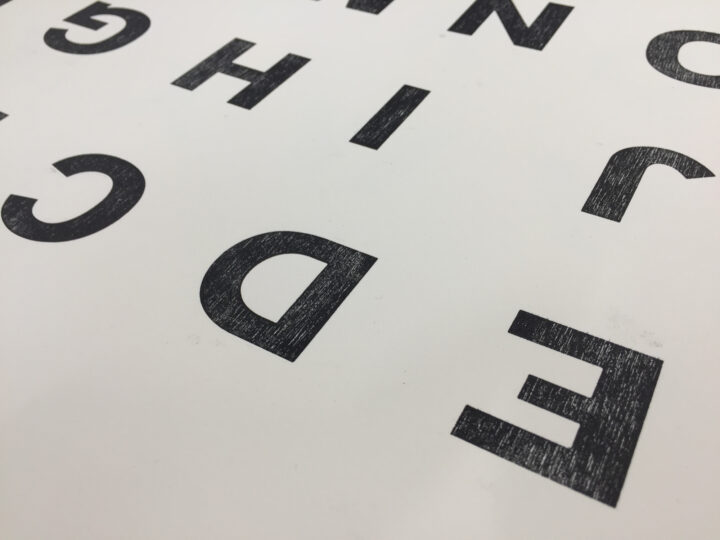
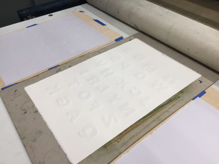
We based the logotype around the utilitarian typeface Trade Gothic – an easy choice given Aberdeen’s printing and paper manufacturing heritage. This was then hand drawn and optically adjusted to make the type feel more lived in, more hand crafted. The characters were cut from hardwood ply to create CoAD Display.
These were letter-pressed at Peacock Visual Arts in Aberdeen on traditional columbian hand presses and modern flatbed presses onto a myriad of specialist stocks until we finally achieved the desired depth and character we were aiming for.
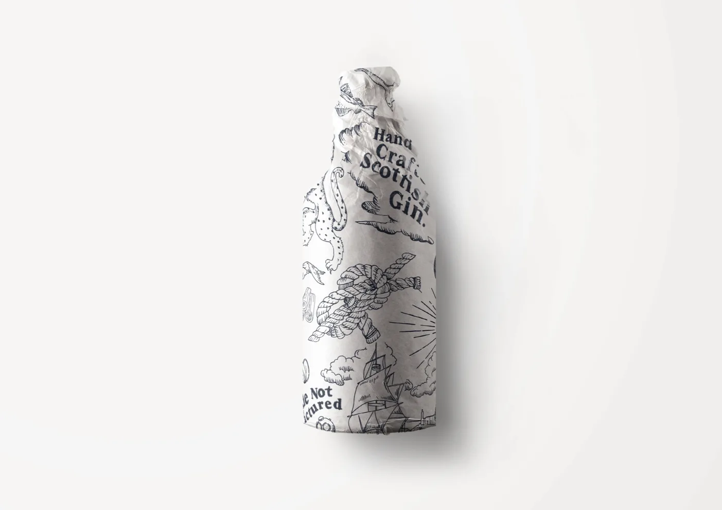
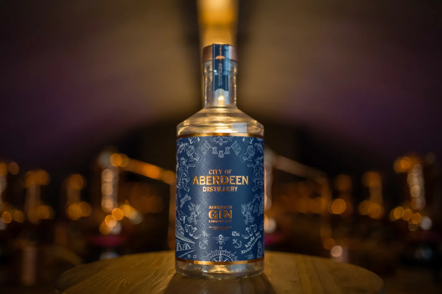
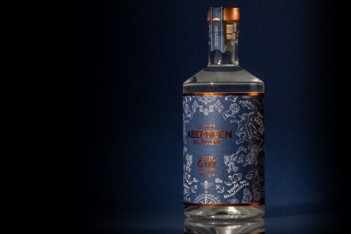
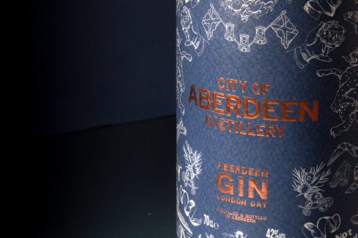
A rich and intricate modern tapestry adorns the flagship bottle and extended brand materials, with delicate foiled embossings and tactile paper stocks adding to this authentic brand experience.
The bottle and brand has been lauded by the Distillery, competitor brands and officials alike, with this unique brand and bottle really capturing the heart of a city.