- Brand Strategy|
- Logo Design
Melt Restaurant
Like having tea at your Gran's - just with a bit more attitude
Reinvigorating the brand of a true family favourite.
James Rizza & Sons have been a family owned and operated business for over 100 years, they're an ice-cream dynasty! With an awards cabinet bursting at the seems - Rizza's are nationally recognised for some of the finest ice cream in the UK, but with a neglected brand and product packaging they were losing ground in the ice cream wars of modern supermarket retail. Cue a brand refresh and packaging redesign which allows them to compete nationally with the FroYo start ups of Gen-Z.
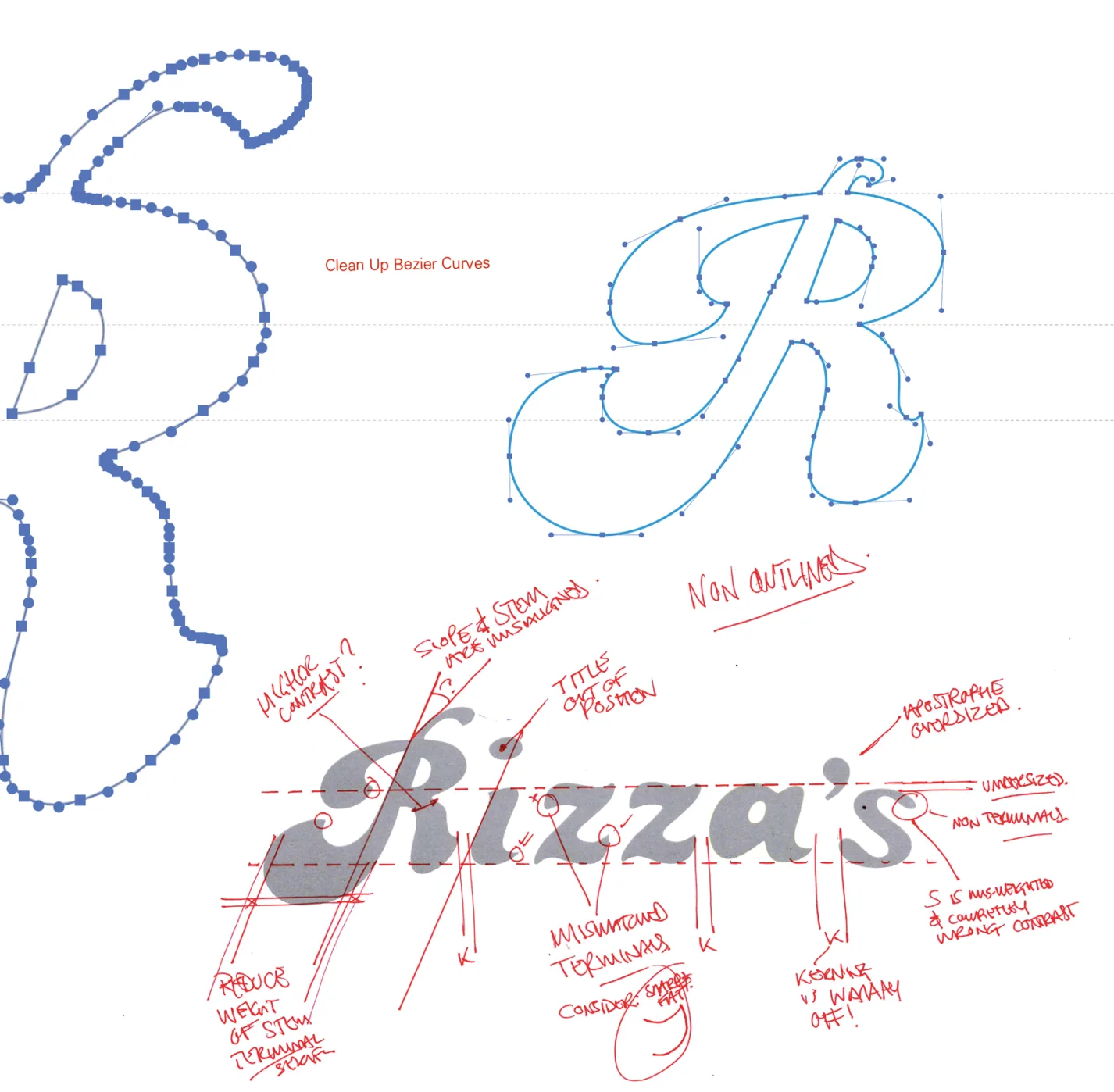
First things first - the logo.
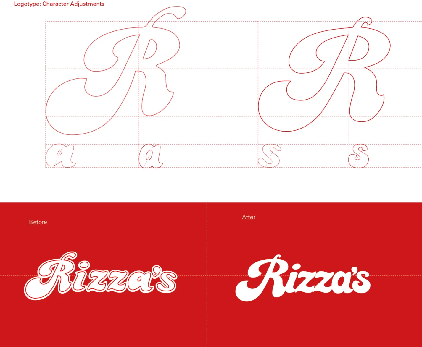
We knew it was the rock, underpinning the whole Rizza's brand, and a massive part of their value and brand equity. How could we change it? We knew there would be outrage across Scotland if there was an uber cool new logo presented on the new packaging - so we went back to basics. Retaining all the character and recognition in the logo was paramount, but it needed to become more of a cohesive marque, one that was considered in all the right places. Adjusting each character by hand was the only way we would get the result and retain the feels.
The team at Rizza's knew they had to re-establish themselves on the shelf if they were to scoop a chunk of the growing take-home ice cream market.
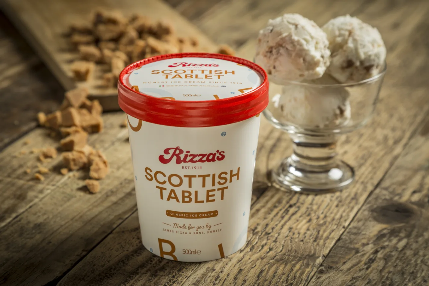
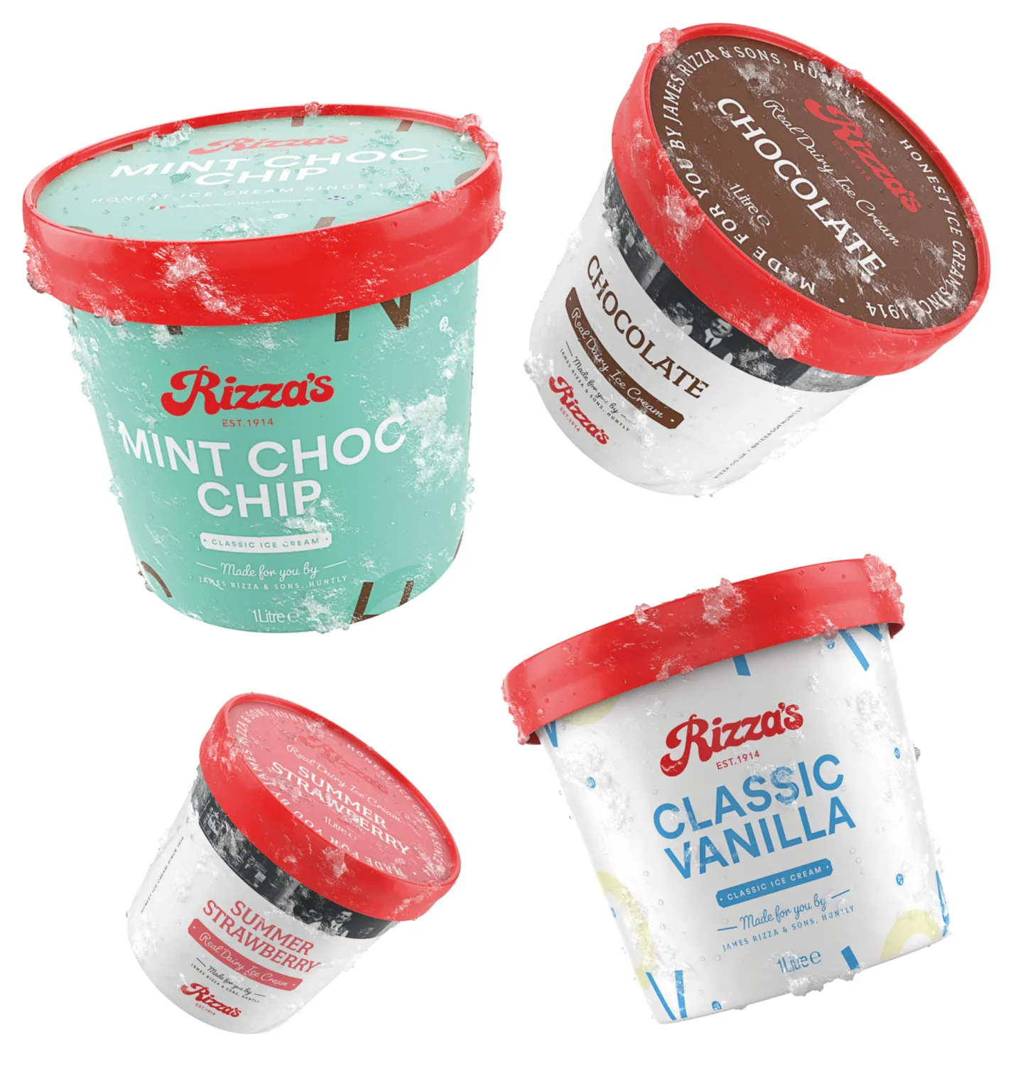
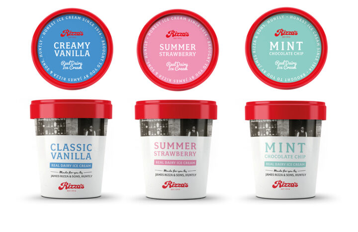
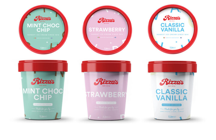
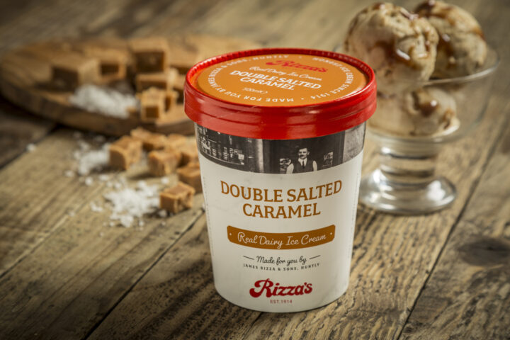
We knew their strengths - the product, the brand marque, and a real family story - all we had to do was transfer these onto a widely-used pretty average circular pot about 150mm tall. First off we renewed the famous Rizza's brand mark. Modernising, simplifying and restructuring the logo ready for the consumer shelf. While refreshing the logo, and auditing a wealth of historical brand materials, we found the key to the whole project — Red. Once upon a time, all Rizza's material had been red, from freight labels to freezer vans - carpets to cone holders, they were all red. Over the years this most valuable of brand assets had been watered down and all but lost over the years
The Rizza's Red Top
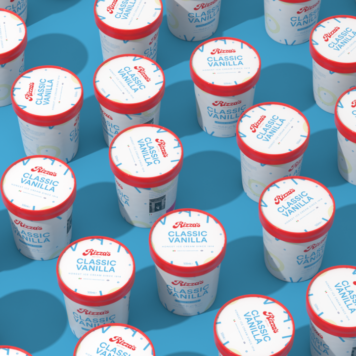
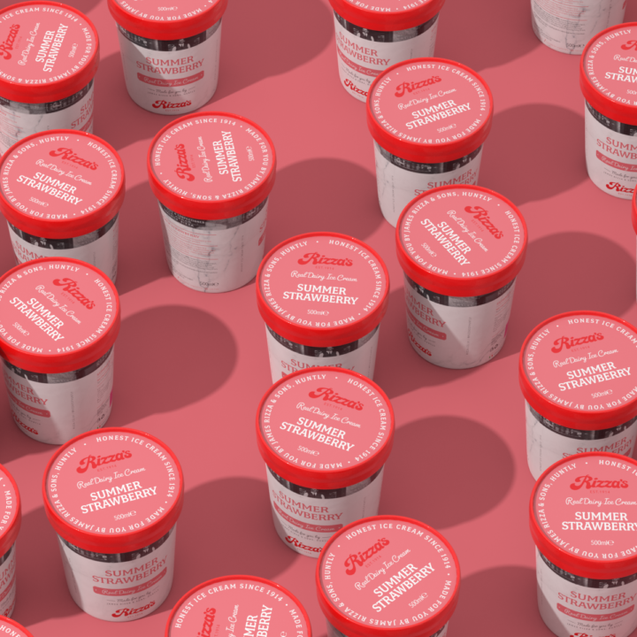
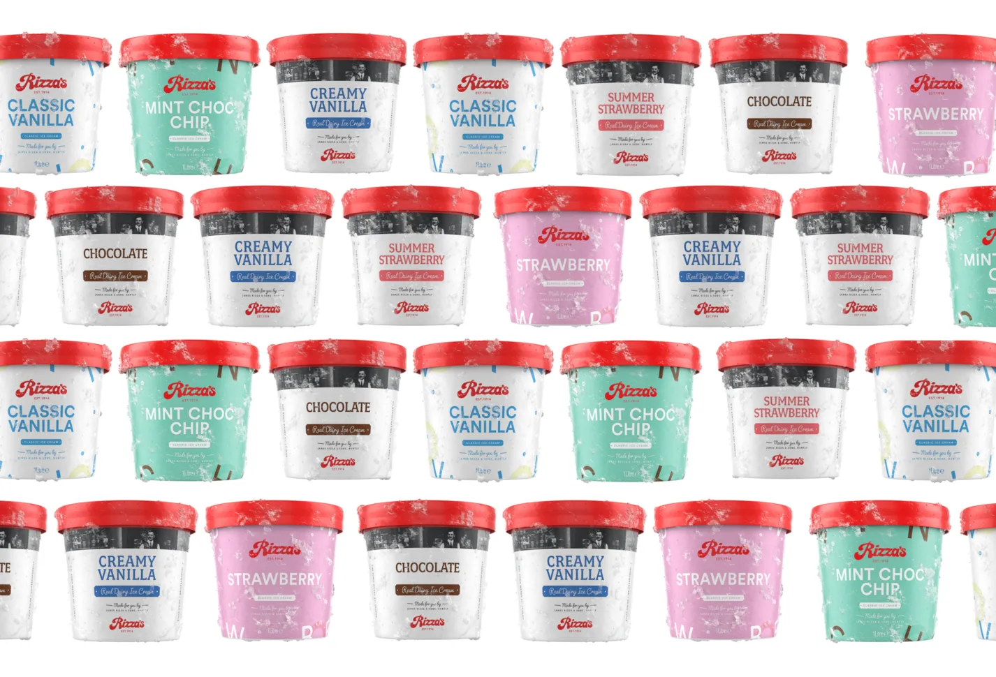
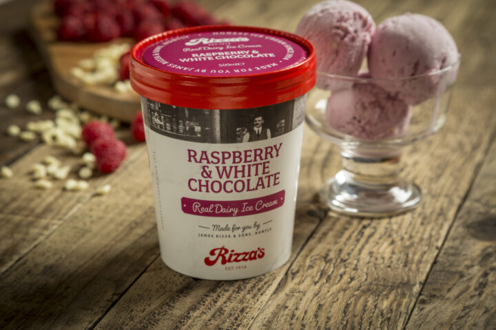
So we gave Rizza's their red back. We created a beautifully simple yet hugely powerful printed device, The ‘Rizza’s Red Top’ - a bright red lid runs on every flavour, every pot size, across every range of their take-home ice cream. The Rizza's Red Top is a defining asset of the brand - it’s shorthand for their heritage, a mark of quality and value. The red lids of the Rizza's tubs create a wall of colour, a wall of Rizza's, they mark their territory and are a constant in an otherwise chaotic shelf of overbearing colour and action packed cartoons.
