- Brand Creation|
- Web Design|
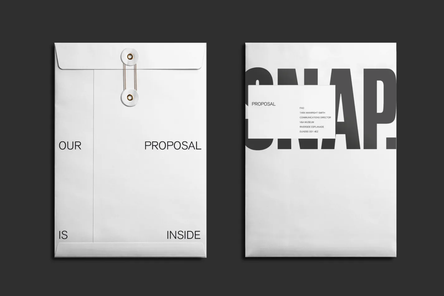
- Packaging|
- Brand Strategy
Outlaw Rum
Brand and packaging for a rebellious spirit
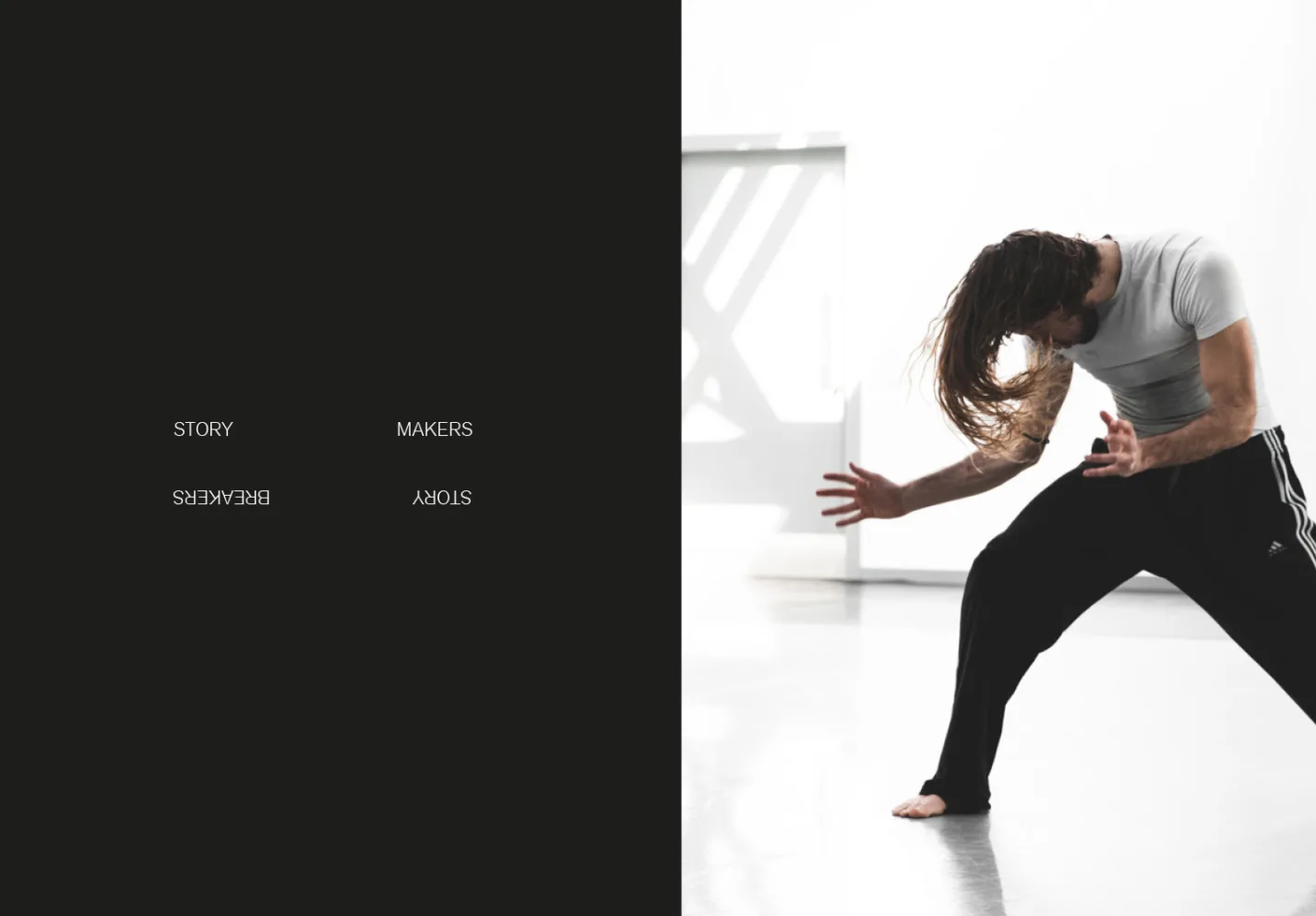
Story Makers — Story Breakers
BRAND STRATEGY
IDENTITY CREATION
MESSAGING
WEB DESIGN & BUILD
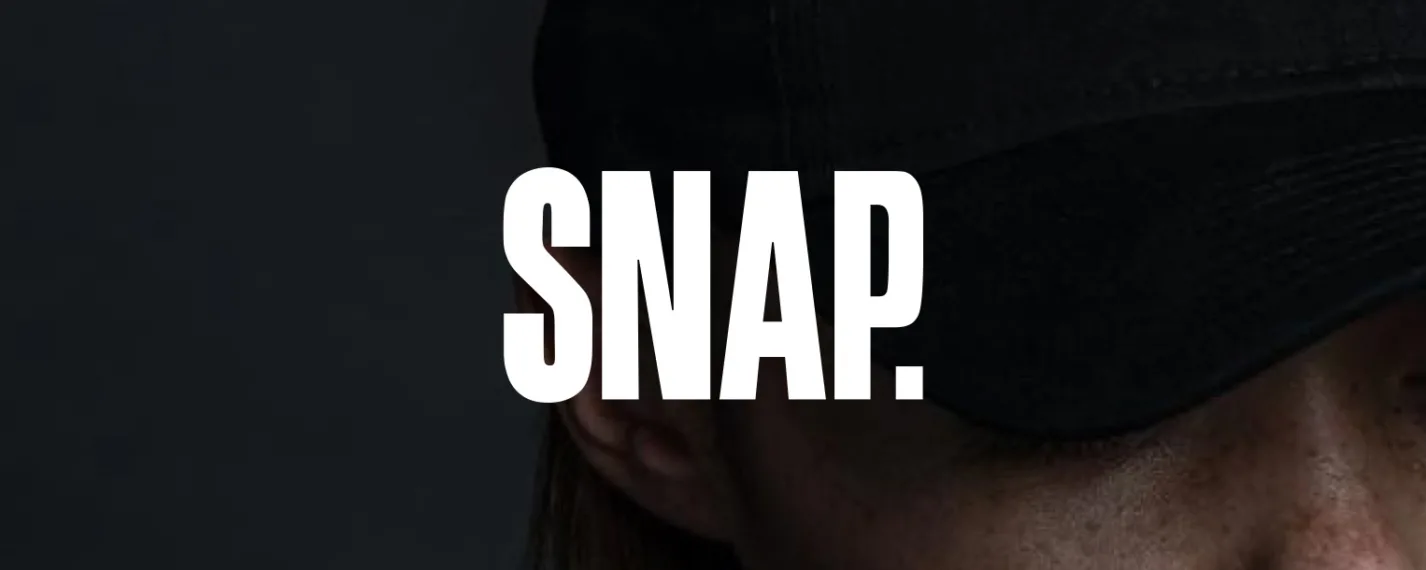
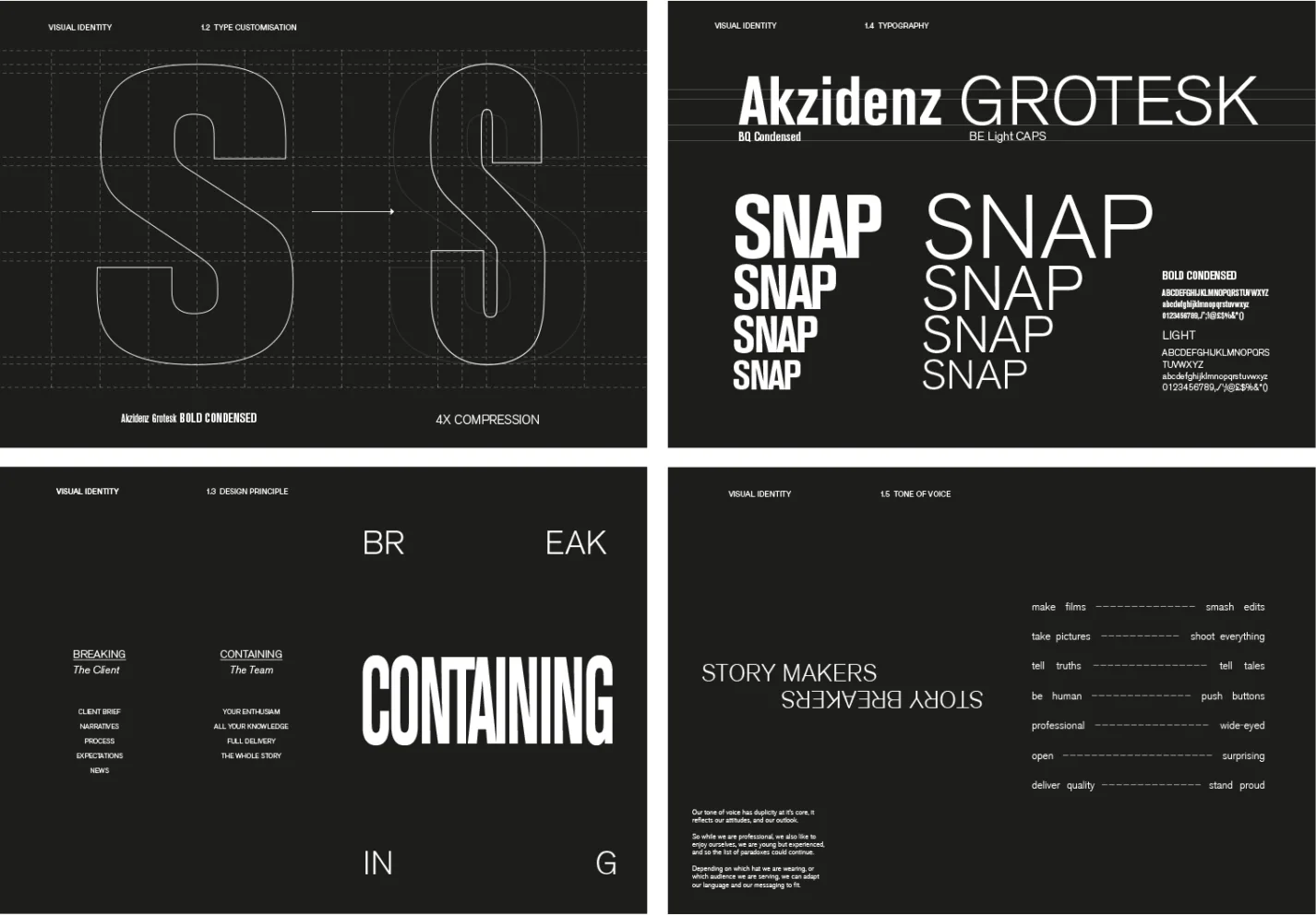
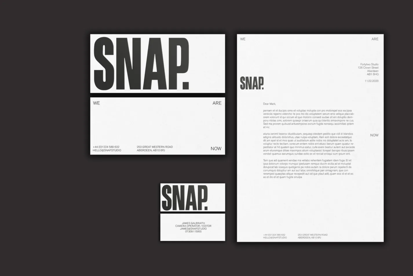
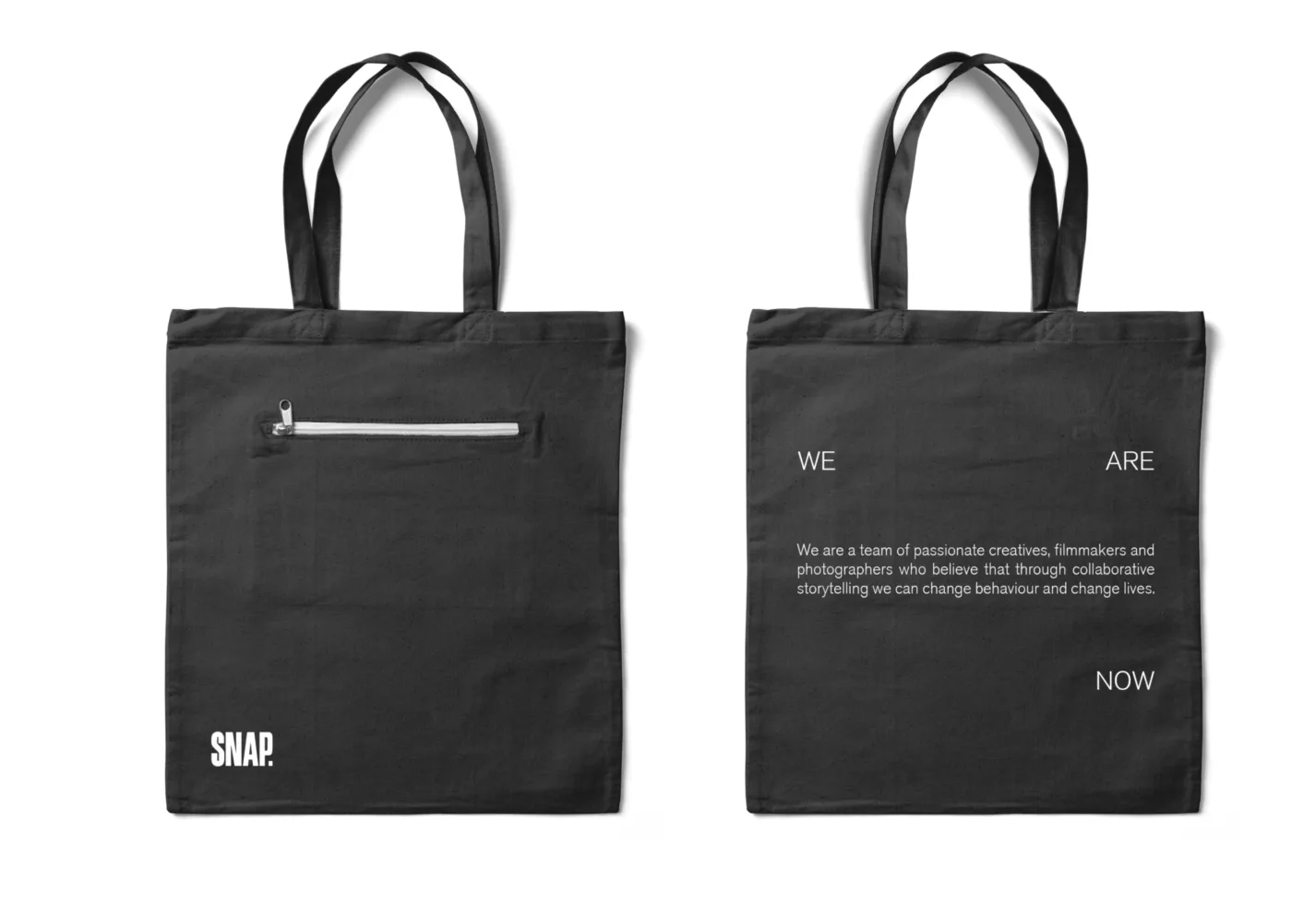
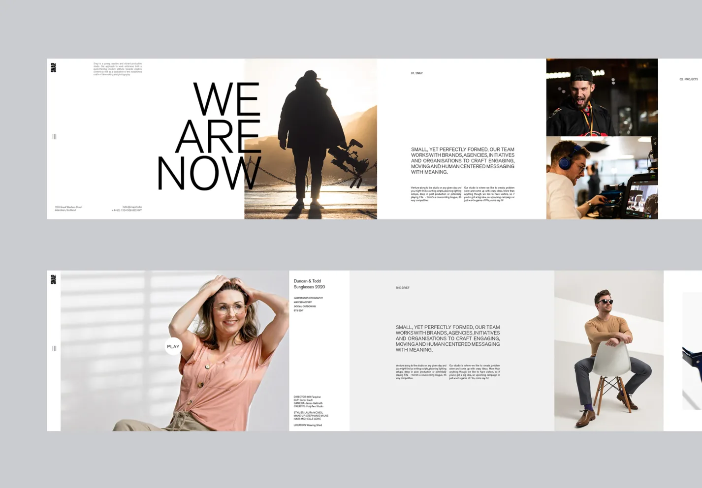
Rebranding a group of visual juggernauts is one of the the best briefs, and one of the most difficult a designer can get. Remaining true to the clients' craft — to their aesthetics — and making sure the brand stays out the way of their work is paramount. SNAP know what they like, and they know want they want. Brimming with excitement and ambition, they have fast become one of the rising stars in UK video production. An unwavering dedication to filmmaking, a real desire to tell the real story behind a clients vision — this is what sets them apart from the crowd. They had outgrown their start up identity which reeked of a young studio trying to make it. It was time to take stock, refresh how they spoke and renew their aesthetic. They asked us for an identity that matched the impact and immediateness of their work.
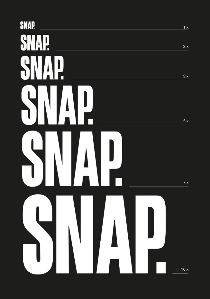
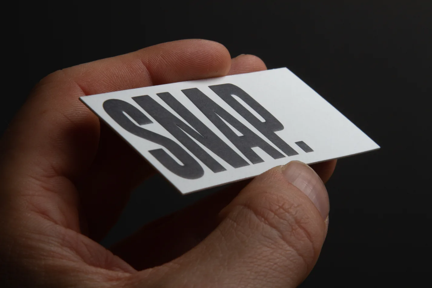
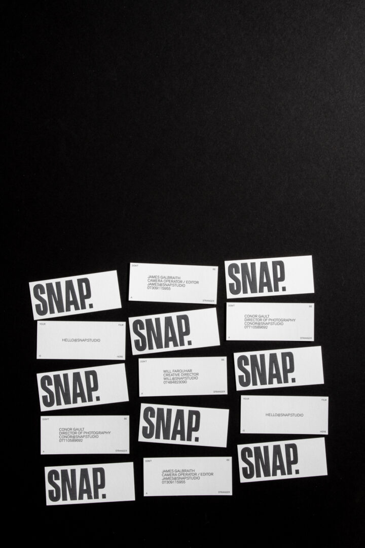
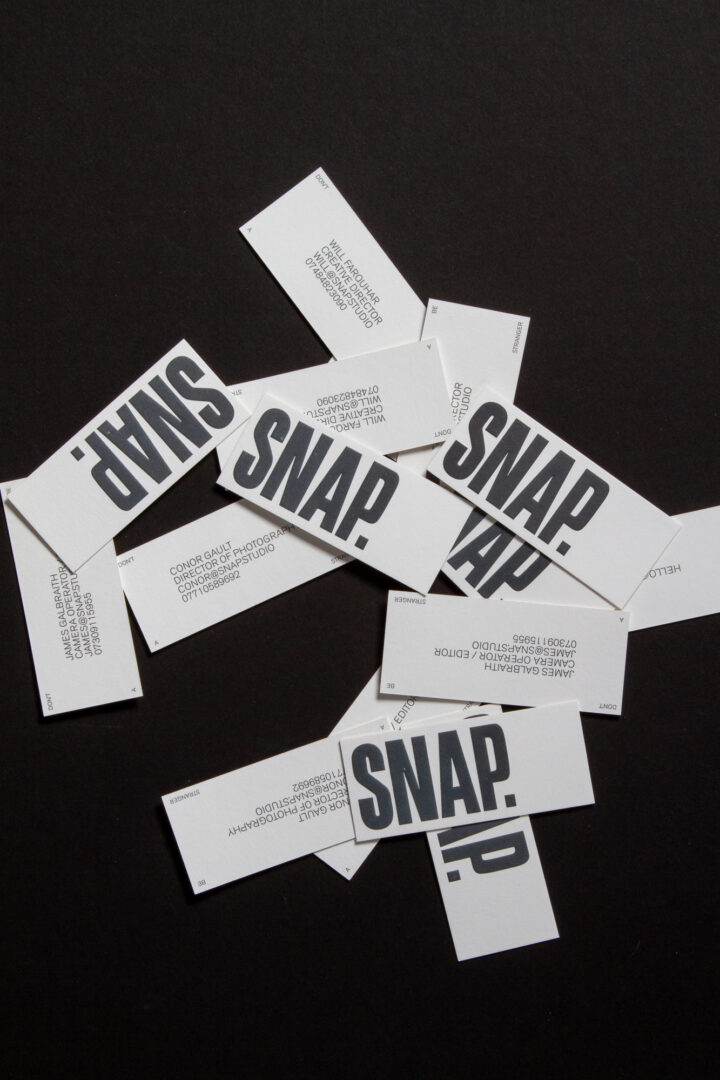
We set out to transform them from soft and passive to bold and unmissable. Using a confident custom logotype and messaging system, which firmly set them apart from the corporate and sometimes passive competition. A line in the sand, an unmistakable voice in a busy and crowded market. We devised a graphic system rooted in the very craft of film making and adaptable to any scale or medium — allowing them to shout when they wanted to, or step back when the story needed them to.
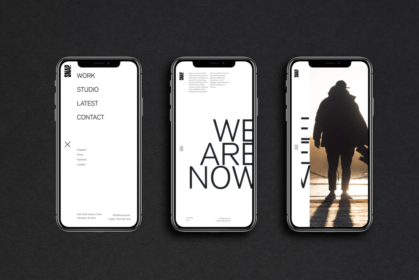
Fully responsive
Horizontal scroll
Custom CMS
Key to the project's success was the studio's web presence. They needed to separate themselves from the run of the mill production houses, and do things differently.
We created a side-scrolling site, offering full browser imagery and video — immersing the user in the work they produce. Using minimal and structured layouts we allowed the work to do the heavy lifting. Keeping it simple where others get complicated, and offering the viewer time and space to digest the content, this desktop-first concept needed to ooze the minimal aesthetic the team believed in while not compromising on usability or impact.
Sweeping pages, white space and strong imagery make the site a success, nominated for a Scottish Design Award and featured by Design Rush as one of the best Film & Production Websites.
"We wanted to work with an agency that not only put out sh*t hot work but got who we were as a business and as individuals. Enter FortyTwo. We’re super stoked on our new website and branding because it feels like a true representation of who we are. No unnecessary bells and whistles, just hot content and good vibes. 9.6/10 would recommend to a friend! "
Will Farquhar, Creative Director